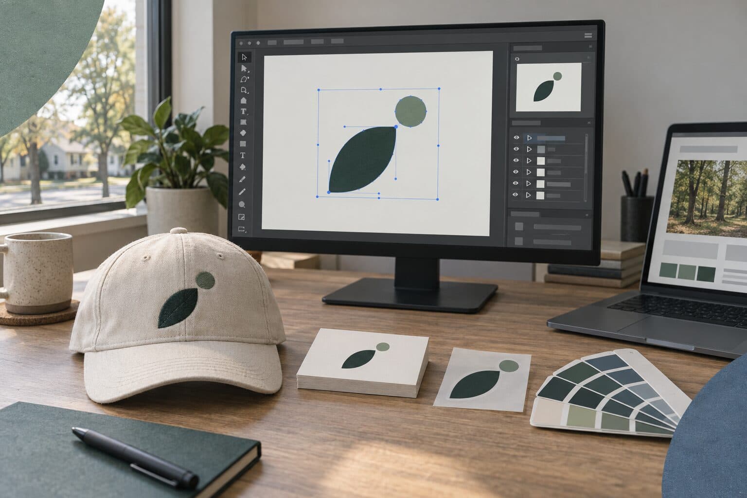
Ask your designer for your logo as vector files (SVG, EPS, or PDF, plus the original Illustrator file) and as PNG files with transparent backgrounds for screens. You should also get it in full color, black, and white, with each color written out for print and for screens, plus a short brand guide and a signed transfer of the copyright. Below is what each of those is for, which file to send when someone asks for your logo, and what to ask before the project ends.
What's the difference between vector and raster logo files?
A vector file stores your logo as shapes and lines defined by math, so it stays sharp at any size, from a business card to a banner. A raster file stores it as a grid of pixels, so it has a fixed size and turns blurry or blocky when you enlarge it.
You need both. The vector file is the master copy that every other version is made from, and the raster files are what you'll use day to day on screens.
Vector formats
- SVG. The vector format web browsers display directly, so it's the one a web developer wants for your site.
- EPS. An older vector format that almost any print or sign software can still open.
- PDF. Easy for anyone to open and view, and a PDF exported from design software usually keeps the logo as vector artwork.
- AI. The working file from Adobe Illustrator. It takes Illustrator to edit it, and it's what a designer will want if the logo ever needs a change.
Raster formats
- PNG. It can have a transparent background, so the logo sits cleanly on a colored background, a photo, or a slide. Use it for your website, email signature, social media, and documents.
- JPG. It always has a solid background, usually white, because the format doesn't support transparency. Use it only where the logo sits on white.
One thing worth checking: an EPS or PDF can hold a pasted-in pixel image and still carry a vector file name. Open the file and zoom in close. If the edges stay crisp, it's vector. If they turn blurry or blocky, it's a pixel image saved in a vector format, and it will print that way too.
Why does your logo need different colors for print and for screens?
Screens and printing presses make color in different ways, so each color in your logo needs to be written out for both. Screens mix red, green, and blue light, called RGB. Full-color printing on a press builds color from four inks: cyan, magenta, yellow, and black, called CMYK.
Some colors that look bright on a screen can't be matched exactly with those four inks, so the print version of a color is picked as the closest match. If your designer only gives you RGB files, the printer has to convert them, and the color can shift in the process.
Pantone and spot colors
Pantone colors are premixed inks identified by number, so a printer anywhere can use the same ink. When a job is printed in spot color, the press prints that exact ink instead of building the color from four. That matters when a color has to match every time, and it's common in screen printing on shirts and other branded items. Plenty of logos don't use a Pantone color. If yours does, the number belongs in your files and your guide.
For each color in your logo, ask your designer for these.
- The Pantone number, if the color is matched to a spot ink
- The CMYK values, for printing
- The RGB values, for screens
- The HEX code, which is the same screen color written the way websites use it
Which versions of your logo do you need?
One logo usually needs several versions, because it has to work on light and dark backgrounds, in a single ink, and in small spaces. A complete set covers these.
- Full color. The main version, used wherever the colors will show properly.
- One color. The whole logo in a single color, for one-ink printing, engraving, stamps, and embroidery.
- Black. For invoices, forms, newspaper ads, and anything printed in black only.
- White, also called reversed. For dark backgrounds and photos, where the full-color version would be hard to see.
- Horizontal and stacked. A wide layout for website headers and signs, and a taller one for square spaces.
- The mark on its own. The symbol or initials without the name, for places too small for the full logo.
Favicons and social profiles
Two small spaces are worth asking about by name. A favicon is the small icon in a browser tab and next to your site in Google search results. It has to be square and it shows up very small, so it's usually the mark on its own, simplified if needed.
Social profiles show your logo small too, and many of them crop it. Facebook, for example, crops a Page's profile picture to a circle, which cuts the ends off a wide logo. Ask for a square version with the mark centered and some empty space around it, then check the size each platform asks for when you upload it, since those change.
Which file to send to a printer, sign shop, embroiderer, or web developer
When someone asks for your logo, the right file depends on what they're making. Here's what each of them usually needs.
A printer
Send the vector file, usually a PDF or EPS, with the colors in CMYK, or with the Pantone number named if the job is printed in spot color. Ask the printer which format they prefer before you send anything. We set up artwork the way your printer needs it, and we can coordinate the print run if you'd rather not deal with it.
A sign shop
Send the vector file. Vinyl letters and shapes are cut by a machine that follows the lines in a vector file, and it can't follow pixels. A PNG has to be traced back into vector shapes before it can be cut, which adds a step and may not match your logo exactly.
An embroiderer
Send the vector file and your brand guide. An embroiderer rebuilds your logo as stitches, a step called digitizing, and very small text and thin lines are hard to stitch cleanly. If your logo has fine detail, ask whether a simplified version would work better on a hat or a shirt.
A web developer
Send the SVG for the site itself, PNG files as a backup, the square mark for the favicon, and the RGB and HEX values for your colors. If your brand font is going on the site, they'll need to know which font it is and whether you have a web license for it.
What is a brand style guide, and what should yours include?
A brand style guide is a short document that shows how to use your logo, colors, and fonts, so anyone making something for you can get it right. It doesn't need to be long. A basic one covers these.
- The logo versions, and when to use each one
- Clear space, meaning how much empty room to leave around the logo, and the smallest size it should appear
- Your colors, with the print and screen values for each
- Your fonts, which one is for headings and which is for body text, and where they're licensed
- The things not to do, like stretching the logo, changing its colors, adding shadows, or placing it on a busy photo where it can't be read
Send the guide along with the files. A printer, a sign shop, or a new employee making a flyer can find the right color and version without calling you.
If you're cleaning up a logo you already have, the guide is a good place to start, because writing it down shows which files and color values are missing.
Source files, fonts, and who owns the logo
Source files
Ask for the working file your designer built the logo in, usually an Illustrator file. You may never open it yourself. It's what another designer will need if the logo ever needs a change, and without it they may have to redraw the logo.
Fonts
Fonts are licensed software, and a designer's license doesn't usually cover you. In the finished logo files, the lettering should be converted to outlines, which turns the letters into shapes, so the logo prints correctly without the font installed. To type in your brand font yourself, in a brochure or on your website, you'll need your own license. Adobe Fonts, for example, says a printer or collaborator who needs the fonts must have their own license. A website often needs a separate web license, so ask your designer which fonts they used and where to license them.
Ownership
Under U.S. copyright law, copyright belongs first to the person who created the work, and a transfer to someone else has to be in writing and signed. A logo from an outside designer usually doesn't count as a work made for hire, because commissioned work only qualifies in a short list of categories and with a signed agreement. So the usual route is a written transfer of copyright, signed by the designer. Check whether your contract includes one and when it takes effect.
Ask whether any part of the logo came from stock art, too. Adobe Stock, for example, says its images can't be used in or as a logo, because the license doesn't transfer ownership. Copyright is also separate from trademark. Registering your logo as a trademark is its own step, and a trademark attorney can tell you whether it's worth doing. This is general information, not legal advice.
The same question applies to anything else a vendor sets up for you. Our posts on choosing a freelancer, an agency, or a website builder and what a website costs both cover who holds the domain, the accounts, and the site files.
Questions to ask before the logo project ends
- Which files will I get, in which formats and color versions?
- Are the vector files true vector, with the lettering converted to outlines?
- What are the Pantone, CMYK, RGB, and HEX values for each color?
- Is there a square version for social profiles and a favicon?
- Which fonts did you use, and where do I license them?
- Can I have the source file?
- Did any part of the logo come from stock art?
- Will you sign a written transfer of the copyright, and when does it take effect?
We agree on which files you'll need before a logo project starts, and at the end you get the source and vector files, a brand style guide, and a signed copyright transfer. Our graphic design page covers the logos, brochures, and print we design, and the FAQ explains how a project gets started. If you need a logo, or want help sorting out the files you already have, send us a few details and we'll take a look.